
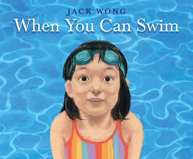
I was lucky enough to get a chance to talk to debut picture book creator Jack Wong about When You Can Swim. Jack's inspirational story of learning to find pleasure in swimming reflects the journey a lot of people take, and I'm so excited that I get to share our conversation with you all today. Enjoy!

In this exploration of what it truly means to swim, expansive vignettes introduce sandpipers, tannin-soaked lakes, and the feeling of a small waterfall on sun-soaked shoulders. But what about those who are afraid of the water's mysterious ways and resist learning to swim?
Peek underneath the dust jacket:
Let's talk Jack Wong!

LTPB: Where did the idea for When You Can Swim come from? What is your connection to the act of swimming and water, and I must know: are you a pisces??
JW: I’m forever fond of how this book came together, because it had humble beginnings that led to unexpected things. It didn’t even start out as a book about swimming(!) but as a series of observations about nature I collected during camping trips, hikes, and walks. When I started to feel that the natural next step was to wade into the water, so to speak, the fact that I’m not an especially daring swimmer actually created the conditions for the theme of “gathering the courage to swim” to emerge—it was also the pep talk I was giving to myself!
The decision to represent children of all different strokes swimming was also not a predetermined one. Initially, I just felt that drawing a repeating pair of characters over and over would be a boring creative choice when the environments they would inhabit were so rich and diverse. That led to the decision to introduce different characters for each scene—but as soon as I made that decision, the question of who to depict needed to be answered, and that led to my very intentional, equitable representation-based choices, which in turn fed back into the ethos of the project. I think that, by not having set out to write about anything in particular, but having its purpose emerge organically, the book gained different layers for different readers to connect with.
I’m not a pisces, but speaking of which, I am a libra—which maybe accounts for me identifying 50/50 as an illustrator and a writer! I’ve worked in so many professions in the past that I’ve learned to feel comfortable bringing a hybrid of identities and perspectives to the table.
LTPB: You feature several aquatic locations throughout the book. What kind of research (visual or otherwise!) did you do to represent such varied locations?
JW: My research for this book really ran the gamut! Firstly, I don’t love relying on photographs—I learn the most about a subject by observing and sketching it in person—but because I was drawing in pastel and that’s a difficult medium to bring on-site, I started doing sketches from memory in the studio, after a trip out in nature. It was a transformative way of working because it changed what I was taking mental note of while I was on location; also, memory being imperfect, the misremembered bits that arise in these sketches get to become part of the idiosyncrasies that make it distinct from reality. You can also see from these sketches that a big part of the research was just finding the combinations of pastels that made the colours I was looking for (more on that later).


And yet… because this project was such a big, daunting, new experience—and because the timeline of the project had me creating the final art in the dead of winter—I also became obsessed with documenting everything photographically, just in case I’d need the information later. This was also new territory for me… I didn’t have a GoPro or anything like that for underwater photography, so I got one of these glorified Ziploc bags you can put your phone in! I also had an older device at the time which didn’t take panoramic shots (or I didn’t know how to), so in some cases I stitched photos together manually to capture a scene. I felt the exercise was just one more opportunity to scrutinize what I was looking at, so I didn’t mind too much.


But the most important part of the research was the swimming itself. Each scene in the book was inspired by a real body of water I’d visited, but since I’m not that strong of a swimmer myself, there were a few scenes that I’d initially just observed from the sidelines… There’s a small bridge you see in the book that’s a two-hour drive from where I live, and in the previous times I’d visited I’d only watched others jump off of it—to complete the book I had to go back to jump for myself! It was important to me that I knew each scene emotionally, and I hope that made a difference in how the words and images turned out.

LTPB: What did you find most difficult in creating this book? What did you find most rewarding?
JW: Initially, my biggest worry was the (lack of) coherence across spreads. I had done so much research and had so many visual ideas for giving each setting its due, but the more I leaned into the specificity of each environment, the more disparate they were from one another.
Over time (and after a few good pep talks from my art director, the legendary Patti Ann Harris), I adopted a new notion: that each turn of the page intentionally carries the viewer into completely different visual terrain, and that—as a tradeoff between priorities—I actually care about that more than I care about consistency. Actually, I also have Sydney Smith’s tremendous work in I Talk Like A River to thank for my change of heart. I was blown away not only by how he seemed to throw out the template with each scene, but by how the unpredictability from page to page ultimately created a richer, more engaging experience. It was a very liberating realization of an approach to the artistry of a picture book that I’d like to advocate for going forward.
LTPB: What did you use to create the illustrations in this book? Is this your preferred medium, and what do you love about it?
JW: I used Prismacolor’s semi-hard Nupastels to create much of this book, along with some watercolour washes for background hues. Pastel is a fairly new medium for me; previously as a visual artist, I drew mostly in black-and-white in dry media such as charcoal, so I chose pastel hoping it was similar enough that as much as what I already knew about drawing would be transferable.
One aspect of pastel that is both exciting and frustrating is that I’m really bound by the selection of colours available, and by the very specific and limited ways in which they interact (for example, how certain colours can/can’t layer on top of each other, and how the elements have to be laid down in a certain order to prevent smudging or otherwise disturbing the wrong part). Many of my studies were about, “I know what I want to create (in my head), now let’s see if and how pastels will let me.
In showing some of these studies, it’s also a good occasion to mention (for any aspiring artists) that sketches aren’t always pretty; don’t be fooled by all those perfect sketchbooks you see on Instagram! In these studies, I was just trying to determine the combinations of pastels that worked, so I couldn’t be concerned with form at the same time.


I also wanted to share that I find digital workflows so invaluable, even when I’m not necessarily looking to manipulate the image digitally (though, full disclosure, I do plenty of touching-up too). One incredibly useful aspect is being able to capture a physical drawing at various stages of development: whereas in traditional drawing/painting there always comes a certain point when one hesitates, thinking, “should I make this next mark, or will it ruin the picture?”, scanning the image is like being able to create a saved state before moving forward. Furthermore, having different states (imported as multiple layers in Photoshop) to flip back and forth between allows me to compare whether, for example, that earliest loose stage of the drawing (which I always think is so great and fear being overworked) was actually so great, or whether (and to what extent) additional refinement was the right choice—and at what point I really did go overboard.
In fact, I have a new problem these days: I’m freed to push most of my physical drawings past the point where they’ve become ruined, so I don’t always have a presentable piece of original art left!
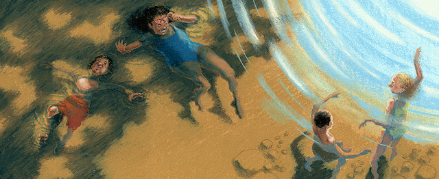
I was quite hesitant to work the water ripples in the top-right corner, but the refinement really was justified
LTPB: How does your process change from book to book?
JW: My ways of working change up quite a bit from book to book. For my next release, The Words We Share (published by Annick Press, October 2023), I felt that the plot-driven nature of the book called for a different treatment than the gentle, naturalistic pastel rendering for When You Can Swim, which would’ve bogged down the snappier story. I wasn’t in possession of a particular medium or way of working that could already achieve what I was picturing in my head, so I had to go searching for it—I tried everything from block- and screenprinting, to stenciling and collage, to drawing with coloured pencils and crayons, to fully digital painting. All this experimentation (floundering, really) informed the final process, which consisted of separately scanning in pencil drawings, and swathes of paint/ink on paper, then collaging the elements together digitally.
Some might even call this a drastic change of style, but I actually see it differently: to me, style is really the aspects of your work that you can’t help having in the work—the sensibilities or predilections towards certain things that persist (sometimes despite your best efforts to change!) For me, I can’t help but treat any scene filmically, thinking about it in terms of “camera” angles and real-world light sources. This might sound like I’m paying myself a compliment, but any preference comes with a tradeoff—I can overcomplicate a scene (I’d backlight all scenes all the time if I don’t keep myself in check!) and struggle with knowing when a simple visual choice is the best one. In any case, my go-to strategies in framing and lighting are aspects of style that I feel I carry from book to book.
LTPB: What are you working on now? Anything you can show us?
JW: I’m currently working on the final touches of a third book entitled All That Grows (Groundwood Books, Spring 2024). It’s about a child who, in discovering an interest in plants and gardening, simultaneously becomes daunted by the seemingly endless complexity of the natural world. It’s a return to some of the narrative preoccupations, as well as illustration approaches, that informed When You Can Swim. I sketched a lot in nature, and also snapped thousands of photos of plants!

After that, I’ll be illustrating a picture book bio of acclaimed cellist Yo-Yo Ma (written by James Howe, published by Abrams Books for Young Readers, tentatively 2025). Since I’m traveling a bit this spring to promote When You Can Swim, I haven’t had much time to work in earnest in the studio—but while I’m on the road, I felt that a way I could start entering the world of this project was to just make doodles of a cellist to the best of my limited knowledge—even before I start to look at photographic reference (which I will do lots of eventually!)
I feel that one of the best skills a figurative illustrator can learn is to make a drawing based solely on feeling (or even just imagining) the embodied sensations of taking a pose—for example, feeling one shoulder higher than the other, one elbow out and the other tucked in—and trying to translate that information onto the page (yes, this does imply I play air cello while I’m sitting on a plane, and occasionally cause eyebrows to rise). It’s an intimate way of getting to know a subject, and again, any idiosyncrasies in translation only help make the image your own.

LTPB: If you got the chance to write your own picture book autobiography, who (dead or alive!) would you want to illustrate it, and why?
JW: I would love to have Kitty Crowther illustrate my autobiography—or, more accurately, her own version of things! Crowther is one of my favourite author/illustrators; reading interviews she’s given about her creative process, the way she crafts stories has a purity that I try to strive towards: to conjure characters that take on lives of their own and tell her what story they want to tell, without preconceived notions. So I feel that if she were to work in “biography,” the subject (me) would just be an avatar for a new piece of fiction to unfold. Also, I love the way she talks about strange, imposing, and even grotesque characters, the way she wants to give room for these characters to roam, which I feel allows her work to reflect the truth that we all have beauty and ugliness inside of us. A New York Times review actually called the characters she drew for Ulf Stark’s The Runaways “ravishingly ugly,” which I think is the most amazing thing any illustrator could achieve!
Thank you so much to Jack for talking to me and answering my questions! When You Can Swim publishes TODAY from Orchard Books!
Special thanks to Jack and Orchard for use of these images!

This post contains affiliate links. For more information, visit my policies & disclosures page
No comments:
Post a Comment