
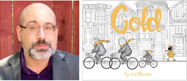
Jed Alexander's wordless book Red has been on my list of favorite Red Riding Hood books since it published, so when I heard that he was publishing a companion book, Gold, I was very keen to talk to him and learn more about his process. I hope you enjoy learning about these wordless books (and what Jed has in store for us next!).
About the book:
What do we think we see as we turn the pages and how is the ending not at all what we expected? This fractured retelling of the Goldilocks fairy tale provides a perfect format for thinking about story-telling and how families can be different--and how they are the same.
Check out the book trailer:
Let's talk Jed Alexander!

LTPB: Why did you choose to explore the story of Goldilocks in Gold? And any reason you made the decision to go wordless?
JA: I wanted to go wordless because it seems like the purest and most challenging form of the picture book. It requires clarity and simplicity. One thing I like about wordless picture books is that they engage the reader's imagination in a unique way. There's a lot of room for the reader to invest themselves in the story and make up their own minds about what's happening and who those characters are and what happens to those characters after they've closed the book. The book becomes its own little world. And you have to make those page turns compelling!

Goldilocks seemed like a natural to follow Red. I'd originally titled it Yellow but my editor at Cameron suggested Gold which made perfect sense. Unfortunately Cameron cancelled the book just prior to release, but Marissa Moss from Creston Books rescued it. Now I'm doing a third with Marissa, Olive, which is going to be a loose take on Jack and The Beanstalk. That should be out in the fall of 2023. More below!
LTPB: Where did the idea for this loose-knit series come from?
JA: I was originally inspired by the Nutshell Library by Maurice Sendak; a little box set of four tiny three-color books. I think the publisher had in mind a series of Nutshell libraries, but they only ended up doing two; there's also a little known Christmas themed Nutshell Library by Hilary Knight, in red and green, but that one was never reprinted. So most people only know the Sendak version. The idea of a series of tiny themed books with limited color appealed to me. I decided to do wordless color-themed fairy tales, and Red for Red Riding Hood seemed a natural way to start. I love old books with vibrant spot colors. So the original proposal was for a much smaller-sized series of books. When I brought the idea to Cameron & Company, the publisher of Red, they wanted something more like a traditional-sized picture book, so that's what we did.

LTPB: What did you find most difficult in creating this book? What did you find most rewarding?
JA: With Gold, the hardest challenge was what to leave out to keep the reader turning the page, and what to leave in to make sure the reader didn't get lost. Wordless books keep you honest. You have to really hone in on what's essential. The whole process is both rewarding and tedious. I had to draw a lot of houses. That was tedious. Drawing is work. While I do get a lot of joy from it, like any work, sometimes you have to do it even when you'd rather be doing just about anything else. But sometimes there's nothing more satisfying.


LTPB: What can you share about the design of this book? The long, skinny trim size, the color on the fore-edge of the papers, the cloth spine...How involved were you in adding these details?
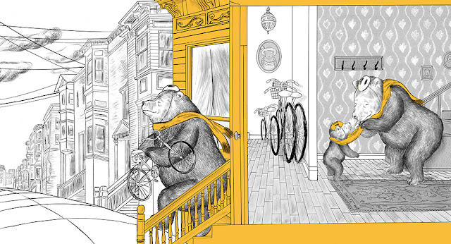
JA: The fore-edge color was a complete and pleasant surprise to me when I received my advance copies. That, and the cloth binding was all Melissa Greenberg, who designed Red. Simon Stahl carried that through at Creston, for Gold. My original format for Red was a square, but we ended up on that horizontal format, which I'm glad for, because I really like those long spreads. It allowed for some great visual opportunities, like the long tail of the wolf, in Red, and in Gold, the long uphill San Francisco street. There were little battles about details--I fought for hand-drawn lettering for the title. That was something that was really important to me. Hand-drawn lettering has more character. Publishing is often a long series of compromises, but when you have good editors, these compromises can ultimately benefit the book. It makes you consider your decisions and focus on what's important. It also can challenge you to come up with new solutions you would have never otherwise thought of.

LTPB: What did you use to create the illustrations in this book? Is this your preferred medium? How does your process change from book to book?
JA: Sometimes with the backgrounds I work very large, on big sheets of butcher paper. Then I trace it all up onto watercolor or bristol board sheets with a lightbox--a box that underlights the drawings so that they can be traced--before inking. It takes a lot of drawing and redrawing. For every figure I do a couple of dozen drawings to get it right. It's a miracle of miracles when something comes out right the first time. But that's usually because I've already done a lot of drawing that day. If something comes too easy I'm usually suspicious.

Then it's finished in ink and brush and crowquill pen, ink wash, and dry brush--a method of using ink with limited moisture on the brush. This is how I got the texture of the fur, and the trees in Red. I do everything in pieces; backgrounds separate from figures, often drawing each individual component on separate pieces of paper. Then I compose it all in Photoshop. While I use Photoshop for small corrections, I use it principally as a compositional tool. It's also very helpful when doing color separations, which is an important step for two-color books. The black and the gold have to be on separate printing plates.

I raised money for my first book, (Mostly) Wordless, with a crowdfunding campaign. It was self-published and is now out of print. It was a sort of sampler; a bunch of little self-promotional short pieces I'd done all collected into one book. That was a great opportunity to explore every step of the publishing process, from layout, to choosing the paper, to designing every aspect of the book. I also used to work for a local printer and that helped me to understand how books are made. So with Red, I had to get used to working with an editor and designer, since with (Mostly) Wordless I could make everything exactly how I wanted it to be. Now with Olive, after having done two books in this format, I was given a lot more freedom. We're going to be doing something a little different with Olive. Most of the book is meant to be read vertically. Sort of like how you'd open a calendar. So: big tall spreads! I haven't seen anything quite like it, so I'm looking forward to seeing what people will make of it.

LTPB: What are you working on now? Anything you can show us?
JA: Olive!


LTPB: If you got the chance to write your own picture book autobiography, who (dead or alive!) would you want to illustrate it, and why?
JA: I think some people have pulled off some brilliant picture book biographies, like Mathew Cordell's recent biography of Fred Rogers. That was beautifully done. Though it's not a form I'm particularly compelled to explore myself. I've got too many of my own stories to tell, more than I'll ever be able to commit to paper.
A gold medal to Jed for talking to me about this super fun series! Gold published from Creston Books last month!
Special thanks to Jed and Creston for use of these images!


This post contains affiliate links. For more information, visit my policies & disclosures page
No comments:
Post a Comment