
I've been a fan of Salini Perera's work for a while now, and I'm thrilled that the stars have finally aligned and I get to share my conversation with Salini here with you all today! We're talking about All the Faces of Me, written by Laura Alary and the very personal process behind the illustrations. Enjoy our chat!

About the book:
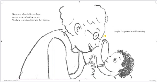
A little girl admires her nana's wooden nesting dolls that sit side by side on the windowsill. They all look exactly the same: pink cheeks, frilly aprons, and big smiles--except for the tiniest doll, which is small and unpainted and looks like a raw peanut. The girl thinks the matching smiles of all the other dolls don't feel quite right. After all, she has many different faces and feelings inside of her, and the dolls should too!
Starting with the peanut, the girl draws new expressions on all the dolls' faces, from toothy grins to grimaces. But when Nana sees what her granddaughter has done, she's furious and says the dolls are ruined. The girl disagrees. "If those dolls were me," she says, "no two would be alike." When Nana considers what her granddaughter is telling her, she slowly begins to understand. With a hug, and a warning to ask before embarking on any more art projects, Nana proudly returns the dolls to their spot.
Starting with the peanut, the girl draws new expressions on all the dolls' faces, from toothy grins to grimaces. But when Nana sees what her granddaughter has done, she's furious and says the dolls are ruined. The girl disagrees. "If those dolls were me," she says, "no two would be alike." When Nana considers what her granddaughter is telling her, she slowly begins to understand. With a hug, and a warning to ask before embarking on any more art projects, Nana proudly returns the dolls to their spot.
Peek underneath the dust jacket:
Let's talk Salini Perera!

LTPB: How did you become the illustrator of Laura Alary’s text All the Faces of Me? How do you make a conscious effort to tailor your illustration style to each new manuscript?
SP: I had previously worked with OwlKids on another book called Beautiful You, Beautiful Me; the editor on the book brought me the manuscript for All the Faces of Me. She thought that I would be a good fit for this particular story, and when I read it, I realized she was right. Even though the nesting dolls and the characters in the book are of Ukrainian background, I have always loved dolls and the decorative arts. Funnily enough, I have painted many sets of nesting dolls, including one for the final project in my illustration program ten years ago (it was Henry VIII and his six wives — if you’re curious).


Something about this particular story — maybe because it’s set in Nana’s house — made me want to give this book a vintage feel. Whenever I begin a new project I start with visual research — I essentially assemble a mood board, with a particular focus on time and place.

My three main sources of inspiration for this book were eastern European folk art, especially colourful Ukrainian floral paintings; the work of Marc Chagall; and vintage mid-century children’s book illustration: with a kind of limited palette, flat colour application, and dark, textured line-work on bright white pages.


LTPB: Did you have a clear vision for the illustrations when you saw the text? What were the first images that popped into your mind when you saw the manuscript? Did you know you were going to stick to a limited color palette?
SP: The first thing I thought of was my own childhood, actually. Growing up, I never saw kids in books who looked like me. When I saw this story, I had a clear vision of the protagonist as a chubby brown girl with curly hair. I brought the idea to OwlKids, and they were enthusiastic about it. Laura, the author, was incredibly supportive and so generous to allow me to put so much of my own childhood experience into this book.

All the Faces of Me is heavily informed by my nostalgia. The protagonist is me — her dress and headband are based on some of my favourite clothes from when I was little. The photographs in her album are actual photos from my childhood — I did genuinely dress up as the Phantom of the Opera for Halloween. Her cat was inspired by my cat Alice (who was just a new kitten, and always under foot while I was illustrating this book).


I didn’t grow up around either of my grandmothers (one had passed away before I was born, and the other was in Australia) but I did grow up in front of the TV. Nana in this book is sort of a combination of Jean Stapleton and Bea Arthur. Funnily enough, she did end up looking a good deal like Laura’s own grandmother — it was a complete coincidence, I never saw a picture of her until a year after I’d finished the illustrations.
In my head, I envisioned Nana’s apartment as a time capsule full of midcentury to 1970s furnishings and textiles — some of it based on my own childhood home. The chair with the pheasant pattern was inspired by the living room set my grandfather bought us from the Goodwill when we first came to Canada. There’s also the ubiquitous black lamp — that I’m convinced everyone’s parents or grandparents owned in the 90s/2000s. Ours sat in our living room, and later the basement for over 20 years. The silver record player, and the records the little girl listens to are based on ones I grew up with and still own — another odd coincidence I happened to share with Laura.
I always knew I wanted the palette to be limited — but it did expand as I went along. It was initially supposed to be just orange and grey — like the graphite of a pencil, then it was orange, grey and blue etc etc.
SP: I had previously worked with OwlKids on another book called Beautiful You, Beautiful Me; the editor on the book brought me the manuscript for All the Faces of Me. She thought that I would be a good fit for this particular story, and when I read it, I realized she was right. Even though the nesting dolls and the characters in the book are of Ukrainian background, I have always loved dolls and the decorative arts. Funnily enough, I have painted many sets of nesting dolls, including one for the final project in my illustration program ten years ago (it was Henry VIII and his six wives — if you’re curious).
SP: The first thing I thought of was my own childhood, actually. Growing up, I never saw kids in books who looked like me. When I saw this story, I had a clear vision of the protagonist as a chubby brown girl with curly hair. I brought the idea to OwlKids, and they were enthusiastic about it. Laura, the author, was incredibly supportive and so generous to allow me to put so much of my own childhood experience into this book.
In my head, I envisioned Nana’s apartment as a time capsule full of midcentury to 1970s furnishings and textiles — some of it based on my own childhood home. The chair with the pheasant pattern was inspired by the living room set my grandfather bought us from the Goodwill when we first came to Canada. There’s also the ubiquitous black lamp — that I’m convinced everyone’s parents or grandparents owned in the 90s/2000s. Ours sat in our living room, and later the basement for over 20 years. The silver record player, and the records the little girl listens to are based on ones I grew up with and still own — another odd coincidence I happened to share with Laura.
I always knew I wanted the palette to be limited — but it did expand as I went along. It was initially supposed to be just orange and grey — like the graphite of a pencil, then it was orange, grey and blue etc etc.

LTPB: What did you use to create the illustrations in this book? Is this your preferred medium? How does your process change from book to book?
SP: I used Procreate; this is my 11th book published, and I’ve done them all on the iPad. I primarily work digitally, but I’m always looking for ways to incorporate real-world textures and techniques into these digital paintings.


LTPB: What are you working on now? Anything you can show us?
SP: I’m working on a new book from OwlKids called It’s Okay, Just Ask by Monique Leonardo Carlos. It’s about a family immigrating to Canada from the perspective of the youngest child. This one also resonated with me, as I came to Canada when I was 3 years old, and saw so much of my family’s story in this one. It will be coming out next year.

SP: I’m currently teaching illustration at Seneca Polytechnic in Toronto (my alma mater) — I would love it if a former student of mine would someday illustrate a book like that. But if I had to choose from contemporary illustrators, I would choose either Christian Robinson (I love his bold use of colour and thoughtful cut up compositions), or Jillian Tamaki — everything she draws is so graceful and lyrical. The way her figures and linework move across the page is just stunning.
All the thank yous to Salini for talking to me! All the Faces of Me published last month from Owlkids!
Special thanks to Salini and Owlkids for use of these images!


This post contains affiliate links. For more information, visit my policies & disclosures page
No comments:
Post a Comment